Visualizing NFL Positional Spending
The following project was completed for CSC 324: Software Design and Development at Grinnell College.
Introduction
The National Football League employs a competitive balance system in which a strict salary cap is enforced. Every year, a new salary cap figure is instated by the league, and every team’s total payroll (for players) for that year must not exceed that figure. Thus, strategically maneuvering limited cap space and finding market efficiencies is an important skill and a key determining factor for success in the NFL.
As such, the motivation of my project was to observe the ways in which teams choose to allocate their limited salary cap resources and analyze various questions; how spending has changed over time, how it varies from team to team, and how these choices are related to team performance. My goal was to create a comprehensive application that could be used by any fan interested in the National Football League in order to better understand the dynamics of roster building.
Data
Various data sources were leveraged for the purpose of this project.
- Positional spending data was obtained from Over the Cap’s positional spending page (which can be found here). It includes the amount of money allocated to each position by each team in each season.
- I obtained DVOA data from FTN Fantasy’s repository. DVOA is a well-regarded and holistic metric used for evaluating NFL teams overall and at the offensive and defensive levels. Along with DVOA, I obtained win percentage for each team in each season.
- I obtained annual salary cap figures from Spotrac.
- The
nflverse-pbpGitHub repository provided hexadecimal color values for every NFL team for plotting purposes.
Methodology
I implemented four different visualizations to convey four different aspects of the underlying data.
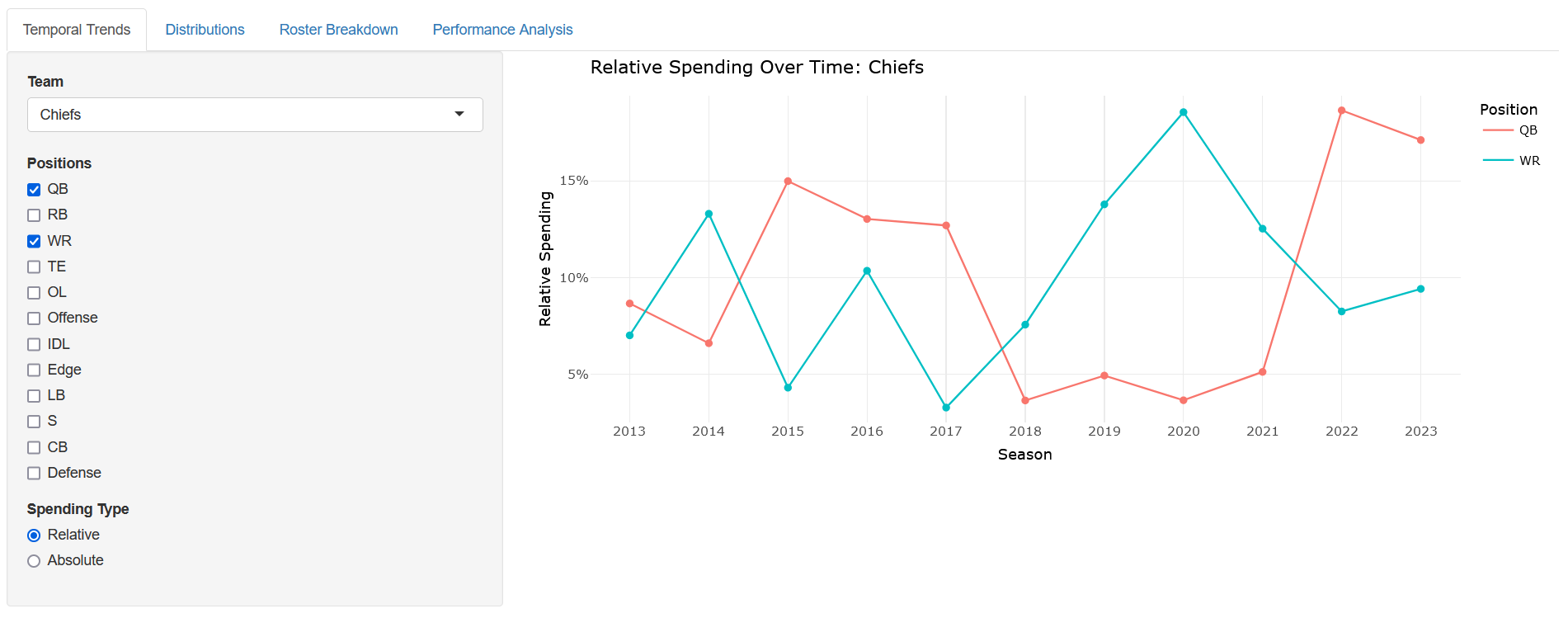
Temporal Trends: The goal of this chart is to show how spending at some positions changed over time at either the league level or the team level. As the name suggests, the key thing here is time and a line plot was selected as being most appropriate to illustrate changes over time. With multiple positions selected, the juxtaposition between multiple lines allows for the user to easily compare and contrast between multiple trends. As seen above, we can see a spike in the relative spending on the QB position for the Kansas City Chiefs as Mahomes was no longer being compensated under his rookie contract.
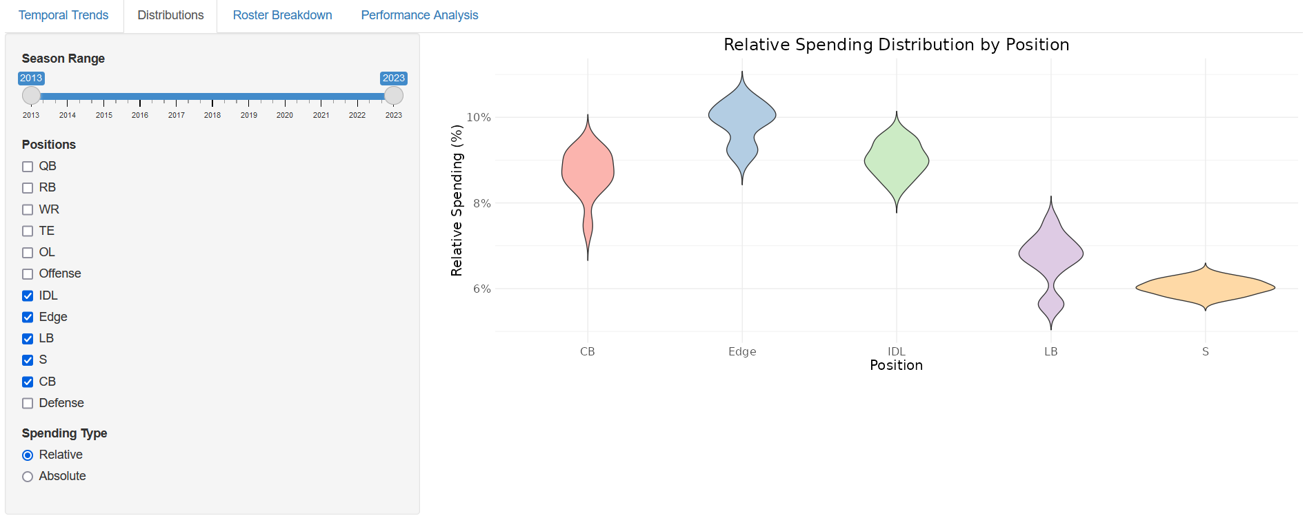
Distributions: Something that isn’t considered in the first plot is variance: two positions can take up roughly 12% of leaguewide salary cap, but one might be fairly consistent in terms of how much teams spent while the other can vary wildly (QB vs WR stands as an interesting comparison). The idea for this chart is to show exactly that: what is the distribution of how much teams spend on each position? I chose a violin plot for this task because I think its allowance for intricate details in the contours of the plot are most relevant to the question of distributions to begin with. The violin plot above shows that NFL teams generally allocate the least money on defense to the safety position.
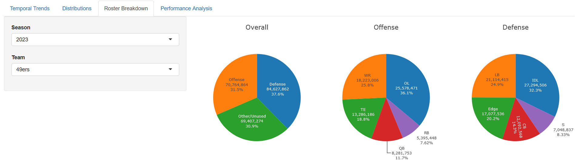
Roster Breakdown: This tab serves the simple goal of illustrating how specific teams’ rosters can he broken down in terms of salary in specific seasons. As a standard method of assessing proportions, pie charts were utilized here to express relative spending.
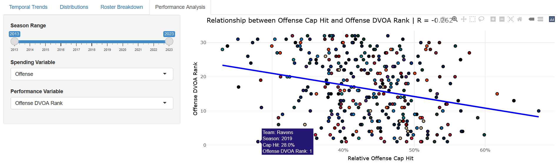
Performance Analysis: Finally, I wanted to tie performance into the mix so that we can see which relationships exist and which individual teams stand out as interesting data points (i.e. the 2019 Ravens spent very little on a very efficient offense). I used a scatter plot with a best fit line, a simple representation of (potentially) linear relationships. By doing so, I do some of the work for the user and let them get a sense of how strong or weak a relationship is.
Insights
I reached many takeaways from playing around with this application, including but not limited to:
-
The money allocated to the running back position across the league has considerably fallen off since the start of the data set (2013).
-
Overall, teams tend to allocate more money on the offensive side of the ball than on defense.
-
Linebackers and safeties stand out as receiving less investment from teams on the defensive end, and running backs and tight ends even moreso on offense.
-
As one would expect, spending more money on offense corresponds with greater team offensive strength. The same is true for defense.
-
Similarly, spending more money at the QB position corresponds with greater team strength and offensive strength. It should be noted that the cause & effect relationship here is not that spending more on a quarterback leads to a stronger team, but rather that having a quarterback worthy of being paid more is indicative of a stronger team.
Future Work
While I believe that my application mostly exhausted what was possible to assess from the data selected, a more comprehensive analysis of the subject should seek more data. Specifically, a player-level data set (cap hit of every individual player) could be used to give more interesting insights. After all, the current tool can tell you how much a team spent on their entire wide receiver corps but not individual wide receivers. This is problematic because, as a hypothetical example, paying $8M for three different solid receivers is not the same as paying $20M for one elite receiver and $2M apiece for two replacement level receivers. Unfortunately, the data used in this analysis would treat both cases as the same: $24M being spent on wide receivers. More descriptive performance metrics would also be interesting (like Pro Football Focus’ player or unit grades). The current tool would allow you to explore the relationship between offensive line spending and offensive performance, but what about offensive line spending and offensive line performance?
Thus, I think the crux of the limitations is that the data itself are limited. Future work should seek to attain more complete data.
References
- https://overthecap.com/positional-spending
- https://www.ftnfantasy.com/nfl/tools/team-total-dvoa
- https://www.spotrac.com/nfl/cba/
- https://github.com/nflverse/nflverse-pbp/blob/master/teams_colors_logos.csv